top of page
Baked on the green
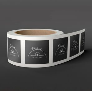
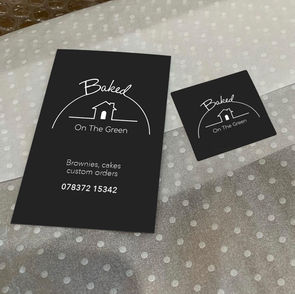
The client, just starting her business, was in need of a logo that was simple and clean. The initial conversation sparked the ultimate design very quickly. Baking, raising, door always open were 3 key points that ended up forming the main elements of the logo. With the logo being really simple we agreed to keep the colours simple as well - black, white and natural (box card) to let
the brownies shine and I can attest to them tasting amazing!

TESTIMONIAL
“I knew James would do a great job as our first chat sparked an idea straight away and with a few minor changes we had it. It's really premium looking and everyone comments, love it!"
Helen West - Owner
bottom of page


